#Outlines in Small Sprites
#
 The purpose of the outline is to provide contrast. It guarantees that the sprite will be visible against any background. Unlike traditional art, a sprite is a moving image, so its background will be changing constantly. The outline’s color will generally be a much darker version of the color you’re outlining.
# I have been an outline snob ever since playing Mario 1 back in the NES days and seeing how ugly it looked compared to Mario 2 and 3. But I have come to realize that a modern sprite should be able to work internally even without solid internal outlines. The main outline around the outside is mostly for background contrast. The sprite itself should not need it. The shapes are the most important part. You can separate them from each other using colors and contrast just like in regular artwork. And if the contrast is strong enough it will seem to match the outer outline.
#Anti-aliasing Small Sprites
 Anti-aliasing can be used to make objects slightly thicker or thinner. This can be useful for showing the shape of the body such as legs and arms in very small sprites.
# The goal of anti-aliasing is to describe the various shapes in the sprite down to a subtle level of detail. It’s possible to describe changes in shape that are even smaller than a pixel.
#
 Super Metroid was one of the earliest games that made heavy use of sub-pixel details.
These techniques are still useful today.Anti-aliasing is one of the most important skills you can learn because it’s the only way to suggest subtle details and subtle changes in shape in an already very tiny image. Use it to clarify how much a shape curves, especially in situations where using a whole pixel would be too much. It can also adjust the apparent thickness of limbs. If you want to show a slight outward bulge, lighten some of the pixels in the outline. If you want to show a slight inward crease or inward curve, slightly darken the pixels along the inside of the outline. Focus on clarifying the shapes first. If you have enough room you can consider adding shading first, and then adding anti-aliasing. I recommend limiting the shades to 4 levels of brightness. This includes the outline. Using fewer than this makes it difficult to adequately describe details. Using more makes the process more cumbersome than it needs to be, without much improvement in quality. Do not add anti-aliasing to the outside of the outline unless you’re working with an image format that supports translucent pixels. (Alpha channels)
Super Metroid was one of the earliest games that made heavy use of sub-pixel details.
These techniques are still useful today.Anti-aliasing is one of the most important skills you can learn because it’s the only way to suggest subtle details and subtle changes in shape in an already very tiny image. Use it to clarify how much a shape curves, especially in situations where using a whole pixel would be too much. It can also adjust the apparent thickness of limbs. If you want to show a slight outward bulge, lighten some of the pixels in the outline. If you want to show a slight inward crease or inward curve, slightly darken the pixels along the inside of the outline. Focus on clarifying the shapes first. If you have enough room you can consider adding shading first, and then adding anti-aliasing. I recommend limiting the shades to 4 levels of brightness. This includes the outline. Using fewer than this makes it difficult to adequately describe details. Using more makes the process more cumbersome than it needs to be, without much improvement in quality. Do not add anti-aliasing to the outside of the outline unless you’re working with an image format that supports translucent pixels. (Alpha channels)
# It’s interesting to note that small sprites naturally have a cartoony look because they have limited shading, selectively exaggerated features, and use outlines to distinguish them from the background… exactly like a cartoon.
#Outlining Larger Pixel Art
# Large pixel-art has different priorities. Defining shapes is easier but making lines look consistent is harder. Anti-aliasing can make long lines look “broken” against bright backgrounds because the background can blend with the brighter pixels creating “gaps.” This is not an issue with internal lines because you can control all of the colors, but the outer lines need to work against any background that might get placed behind the picture.

# There are two ways to address this. Either use translucent pixels in the outer line or skip using anti-aliasing altogether. I’ll cover both, but let’s start with solid lines. By themselves they give you excellent contrast.
# But you can also change the color of the outline to match the direction of the light, creating a nice subtle “bloom” effect that still successfully contrasts against the background.

#Anti-aliasing Large Pixel Art
#
 But that doesn’t mean that anti-aliasing cannot work with larger pixel art, it just needs translucent pixels in the outer line.
# I recently came up with a simplified anti-aliasing technique that makes this easy to figure out. I call it “side-by-side”, where you use a single color to bridge the transition between the jaggies of a line.


# It also makes it easy to slightly nudge a curve outward or inward, depending on where you put the anti-aliasing along the line.


# This also makes it easy to transition between different colors. Normally this is very tricky to figure out with anti-aliasing. But here you just soften the edges with a medium-dark shade of a color, and then replace some of those pixels with an equivalent shade of a different color.


# If you want to use translucent pixels in the outer line, this side-by-side blending can make it much easier to figure out where to place them. Just take the darkest color, make it half translucent, and use it like a medium shade. In this case instead of transitioning to another color, you are transitioning to transparent. This gives the line a more consistent thickness and your picture can look good against any background.


# This avoid the “broken” look that you can get with solid pixels if they blend against brighter backgrounds.
# Solid outer lines with internal anti-aliasing can accidentally make that line look thicker in some places and seem inconsistent. Translucent pixels avoid this problem too.


# I actually got the inspiration for this “side-by-side” anti-aliasing technique from one of Masahiro Sakurai’s videos about pixel art where he showed off how just a single shade of grey can create effective anti-aliasing. Thank you Sakurai-san, you are a credit to porn artists everywhere!
# It can create surprisingly decent results!

# But there is a hazard with this approach. How dark should those in-between pixels be for the internal details? It turns out that what looks perfect on your monitor might look too bright on some other monitors, so I recommend shifting the pixels to look slightly dark, just to be on the safe side.

# This anti-aliasing technique is not quite perfect by itself. Afterwards you might want to add another lighter shade at the edges to make them smoother.


# … and this is can be the end result.
#Shading
# Small sprites usually don’t have room for much shading, often having none at all, but larger pixel art doesn’t have these limitations. Not only does it provide room for shading, but you can even use different shading styles.

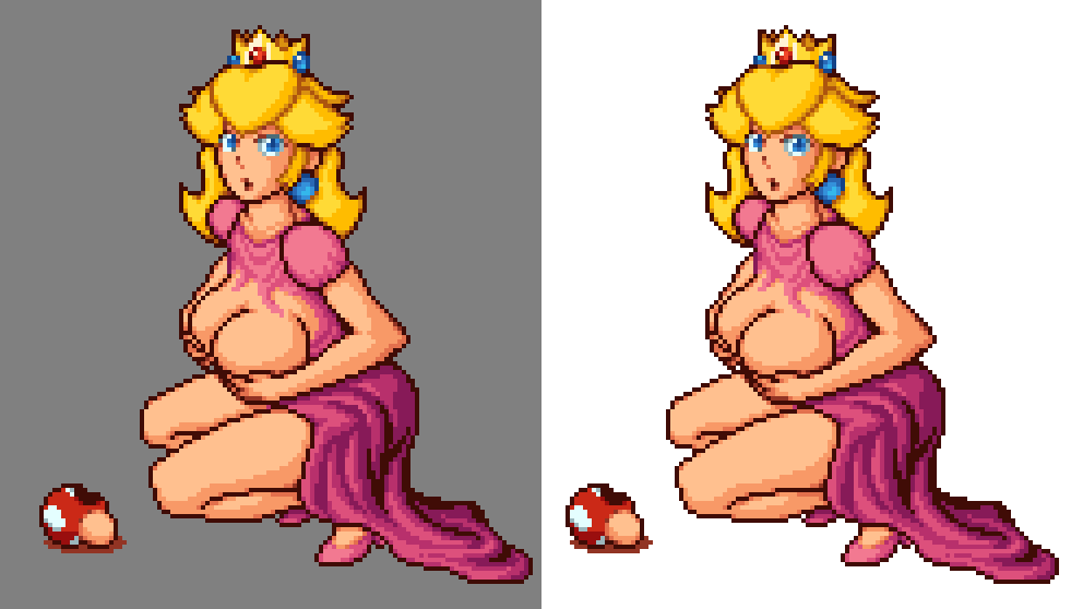
#Bloom Outline
#
 … and if you combine full shading with a “bloom” outline, you end up with an impressively soft-looking “painted” effect, that still successfully contrasts against all backgrounds.

#
 The idea is to create an outline using the same colors as the sprite, only darker.
#
 Step 1. Expand the colors.
You can “expand” the colors outward into the outline by taking the flat “fill” colors, blurring them, and then repeatedly layering them until the transparent parts turn solid.
#
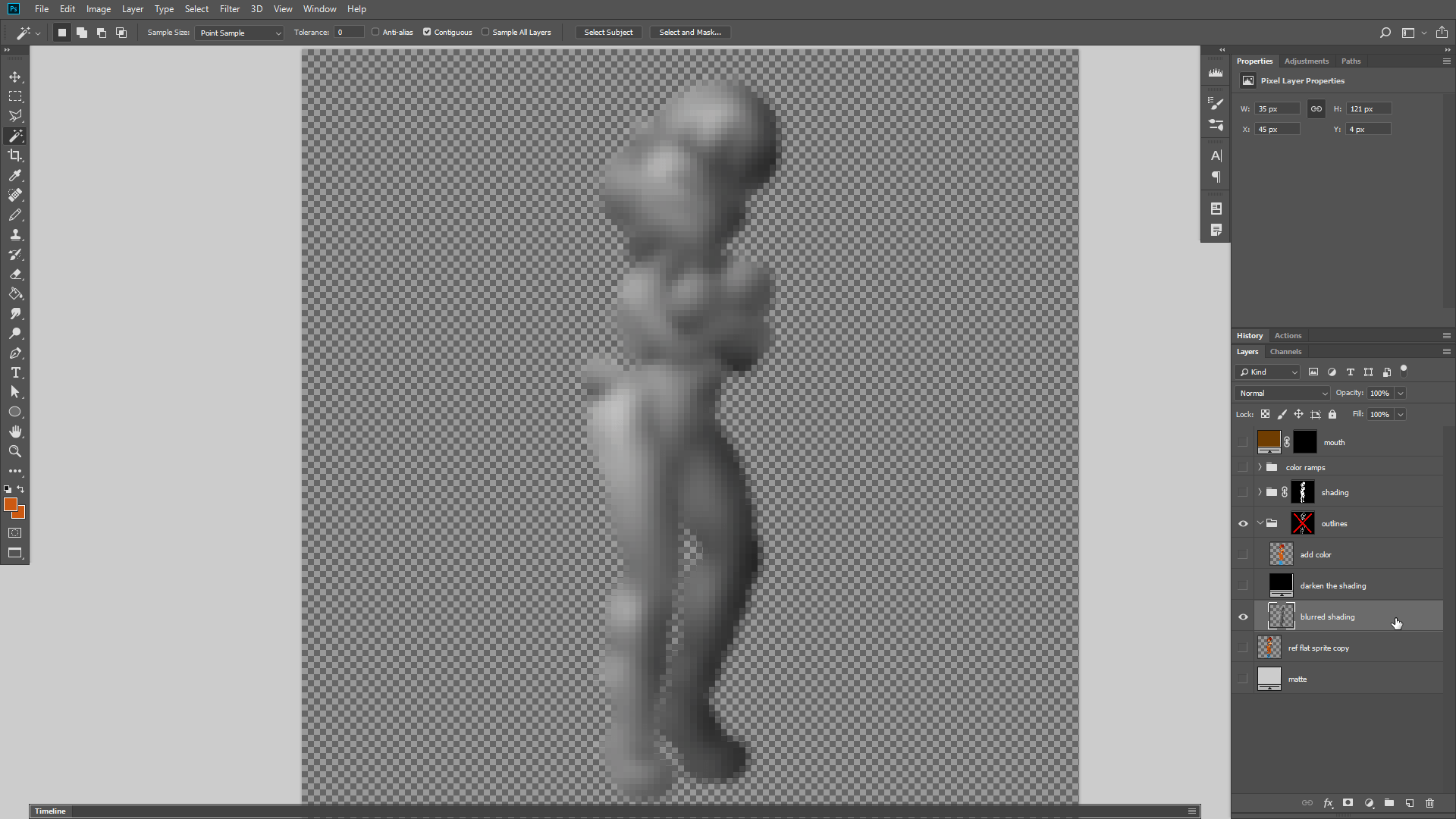 Step 2. Expand the shading.
Then you do the same thing with the shading. Blur it to expand it outward. The reason why you use the shading is because we want the outline to be similar in brightness to the pixels inside the sprite, only darker.
#
 Step 3. Combine and Darken
So the next step is to combine the shading with the colors using the “color” blending mode, and then just make the entire thing darker, by adding 50% black or something.
#
Step 4. Mask it
Now we just apply the original outline as a mask, so that these darkened colors replace the outline.
#Real-time Dither Preview
# Adding dithering by hand can take awhile, and relying on software like PixeLover to generate the dithering after you finish shading a picture tends to result in hapazard pixel placement. But there’s a third approach. It is possible to set things up in Photoshop so that you can see the dithering being applied in real-time while you’re shading a picture.
#
 Start with a finished flat colored sprite. You want to hide this layer, but it’ll be useful for grabbing the outline and color areas. Copy the outline itself to a new layer and keep that visible on top of everything.
#
 Add a simple layer at the bottom for grayscale shading. Use a soft brush.
#
 Boost the contrast of your shading so that the darkest parts are black and the brightest parts are white.
#
 Create a folder for each of the sprite’s major colors. Having a flat-colored sprite makes it easy to select those colors to create these masks.
#
 Add posterizing using a layer effect. The goal is to create a brightness band for each shade of this color in your palette AND for each band of dithering in between each of those colors. In this example I have 1 dark color exclusively for outlining and 3 shades of yellow I want to use for shading, so 3 shades of yellow + 2 shades of dithering in between them = 5 total bands.
#
 Now create a dither pattern using the 2 shades of gray you want to transition between. In this case I’m using black and the second-darkest gray for the first pattern. Apply this pattern as a layer.
#
 Double-click this layer and change the “Underlying Layer” threshold sliders until the dithering only appears on the band you want it to. In this case I want it to apply between the black and second-darkest gray band.
#
 Repeat this process for each in-between color bands. Create a dither pattern, apply it as a layer, and set its threshold to apply to the intended band. You want things to alternate between solid bands and dithered bands.
#
 Finally add a gradient-map layer and set its darkest color to the one you want to use for the darkest shadows and its brightest color to the one you want for your highlights. It’s helpful to have a picture of your sprite palette on hand for this. These gradient maps target every shade of brightness from black all the way to white, which is why you wanted to boost your shading to reach those extremes. But your colors can be anything you want, and don’t need to be super dark or bright. That’s up to you.
#
 You need to re-create this set up for each major color in your sprite. So each color has its own folder with a mask, posterizing, dither-layers, and gradient-map. If you use the same number of shades for each color you can just copy your previous color folder and replace the mask and gradient-map for the new color.
# And after you do, you can go back to your bottom shading layer and just continue softly painting black or white onto it to see the dithered color results in real-time as you make things darker or brighter! I like to press the X key on the keyboard to toggle between black and white while I’m shading.
#Recycling Small Sprites

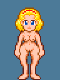
# I almost never make small sprites completely from scratch. Usually, I start with another game character, remove their hair & outfit, then build from there. That makes things much easier since you don’t have to figure out the new character’s proportions, you’ll simply re-use proportions that you already know will work.
#
 You can re-use character bodies by swapping heads & changing outfits. Some sprite artists go even farther, but this has always been enough for me.
#My Process for Small Sprites

#
.
If I need a completely new pose, I figure out the approximate size of the head and then draw each limb in a single color. I add an outline. If there’s enough room, I might add some very basic shading. Then I adjust the body’s shape by adding manual anti-aliasing to the edges. I add the character’s head. And then I add an outfit… sometimes.
In this video, you might notice moments when pixels are flickering back and forth. The video is playing at 8x speed, and I occasionally look at a tiny preview of the sprite and toggle the changes back and forth trying to decide if the changes I just made look better or worse. With sprites, it only matters what they look like at their intended size. (I suppose you could just blur your eyes)
#My Process for Large Pixel Art

# I usually start with either a rough silhouette or I use vector shapes when I want to be more precise about planning the exact shape of the pose.

# Then I fill those vector shapes with colors that deliberately contrast with each other and convert the picture to a very tiny palette with only those colors. This (mostly) discourages Photoshop from blending the pixels which creates hard aliased edges. This will be useful soon.

# Then I resize this down to double the size of my intended pixel art.

# I bring this into Aseprite. I figure out my intended palette. Set the brush size to 2 pixels. Turn on grid-snapping with a 2x2 pixel grid. And then use my “pixel counting” technique to draw the outline with anti-aliasing based on how many pixels are in each grid square.

# After I have the outline, I fill in the flat colors and add the details.


# Then I add the shading. I usually add a new color at this point that I use only for shading. You don’t have to do this but it tends to be convenient.

# And then go back over everything to add anti-aliasing to all the edges and fine-tune every detail until the sprite looks as good as you can make it.
# You will often find time-lapse videos in the descriptions of a lot of my large pixel art pictures, at 60x normal speed. 1 minute = 1 hour. These show my entire process from beginning to end. But you might see me experiment with approaches and techniques from time to time.
#Faces

# Looking back I’ve noticed that the faces in some of my pixel art don’t always have clear details. Some work better than others. So I looked at the some pixel portraits drawn by JustinPaulcyr and realized that the trick might be to start very simple. Draw the face in pure black and white first, then add anti-aliased details later. After all if it works with 2 colors, it’s guaranteed to work with more.
1008 female portraits

# But size can still be a factor. If I want to show the facial expression then I usually want to avoid making it ridiculously small… unless it’s a tiny game sprite. Those have different priorities. So for large pixel art, what if I try quickly drawing my character’s expression in pure black and white, and then scale my reference material down to fit that face? That would theoretically represent the minimum viable size for that pixel art.
# For small game sprites it’s rarely possible to show any expression at all aside from the eyes. Sometimes I can show the mouth. But at that size, a sprite’s priority is just showing the pose itself.
#Proportions
#
 Paying attention to proportions is helpful even with small sprites. But the smaller the sprite, the more you need to compromise on realistic proportions. The eyes should still be centered on the head, unless it’s tilted up or down. But the size of the head compared to the body will generally be either 1/3 to 1/2 the size of the entire sprite. This is because you need to be able to clearly see the character’s eyes, which convey the most expression.
#Why 3D Doesn’t Work Well
#
 3D modeling tends to create blurry pixels at small sizes. Pixel art is all about making every pixel count.This is also why creating small sprites in 3D doesn’t work too well. It’s because the expression gets lost in the blurred pixels. And at that size, you cannot afford the blurry or misplaced pixels you get from 3D. At small sizes, every pixel counts.
#Compression & Anti-aliasing
#
 The image’s compression format will affect how you can anti-alias it. I recommend using the PNG file format, which supports multiple types of compression and transparency and is very widely supported. A PNG file can be either lossless with a huge filesize (24-bit,) or palette-based with a tiny filesize (8-bit.) Additionally, PNG files can use either boolean transparency (pixels are either fully opaque or fully invisible,) or they can use alpha channels (which allows pixels to be translucent.) In Adobe Photoshop, a GIF or an 8-bit PNG cannot have these partially translucent pixels, so you would only be able to place anti-aliasing on the inside of the outline. But if you use any other program, you won’t have that limitation. With translucent pixels you’re able to display full anti-aliasing both inside and outside of the character’s outline.


# An 8-bit PNG with an alpha channel gives you both flexibility and maximum compression. Photoshop cannot directly create these, but a program called PNGquant can convert a 24-bit PNG with an alpha channel into an 8-bit PNG with an alpha channel. (But don’t throw away your source files. Photoshop can’t open 8-bit alpha PNG files either.)
# So unless you’re using PNGquant, do not use anti-aliasing on the outside of the character’s outline. However you can still imitate anti-aliasing on the inside of the outlines by placing somewhat darker pixels at the corners of the outline when it tries to curve. That way, the inner parts of the outline look a little smoother.
#Convenient Preview in Photoshop
#
 When you’re creating anti-aliasing manually, it’s very important for you to see how it actually looks at the intended size, because it’s all about implying and suggesting the changes in shape. But these impressions are only apparent when you view the sprite at a small size.
# In Photoshop, you can view an image at many different zoom-levels at the same time. To do this, go to the top menu, and select:
# Window -> Arrange -> New window for ????
# The choice (or choices) at the bottom will duplicate the image’s window. These duplicates update in real-time because they’re all the same file, so Photoshop won’t remind you to save until you try to close the last one for a given file.
#Anti-aliasing and Animation
#
 To anti-alias an animated sprite, you want to start creating the sprite at double-size until you have the silhouette figured out. Then overlay a 2x2 grid, turn on snapping and set your brush to 2px size. Each click will filll a grid tile. This allows you to manually control how the final sprite will look at half-resolution by drawing over the shapes. The trick to anti-aliasing an animated sprite is to follow the same consistent rules when you outline the sprite in each animation frame:
- When the sprite’s silhouette has only 1 pixel in a grid-tile, fill that tile with the darkest color.
- When the sprite’s silhouette fills 2 pixels of a grid-tile, fill that tile with the 2nd darkest color.
- When the sprite’s silhouette fills 3 pixels of a grid-tile, fill that tile with the 3rd darkest color.
- When the sprite’s silhouette fills all 4 pixels of a grid-tile, fill that tile with the lightest color.
#
 But don’t fill in the fully-filled grid tiles until after you’re done outlining, because trying to fill too soon will distract you from the task of drawing the outline itself. Another rule-of-thumb is I also prefer to only let the two darkest colors touch the background. This means that I outline any lighter colors with dark pixels, and just treat those colors as inner details instead of the outline. After outlining and filling the sprite, I like to add additional detailing, shadows, and smoothing to the inner parts of the outline using the 2nd lightest color. Every animation frame should be outlined and filled from scratch. As long as you follow the same outlining rules you’ll end up with nice consistent results, and the subtle details of the original double-size sprite will be mostly preserved. Here’s a narrated video demonstrating the whole process.